

Redesign a friendly, elegant, and consistent interface for Polarr Photo Editor V6
Polarr is an AI photography startup with 4 million MAU, backed by Threshold Ventures (DFJ). We offer creative and professional tools like Photo Editor, 24 FPS Video Editor, Album+, Aura Filter Community, and Memoir AI Crop to help people craft unique creations.
Brief
Polarr Photo Editor is used by over 2 million photographers globally each month. We've significantly upgraded by adding an AI selection tool with edge-aware capabilities in this project. This tool enables swift selection and editing of objects within photos.
By integrating the new feature, the user flow and interface were simultaneously modified and redesigned.
By integrating the new feature, the user flow and interface were simultaneously modified and redesigned.
Role and Collaborations
As Polarr Photo Editor's primary designer, I worked closely with the CEO and engineering team to develop new features. I also conducted user testing. In just 3 months, I independently created an extensive design system and carried out redesigns.
*Many thanks to our Lead Designer, Lara, for her valuable input throughout the project. Also, Ye and Tiger from the Customer Support and Marketing teams for assisting with user recruitment and testing.
Company / Product
Polarr Photo Editor
Timelime
2018 - 2020
Team
Senior Product Designer: ShaoPing Chen
Frontend Engineering Team: Sean
iOS Developer: Daniel
Frontend Engineering Team: Sean
iOS Developer: Daniel
Tools
Figma, ProtoPie, Principle, Overflow
Pain Points
🔍 Poor Discoverability
Features are difficult to find and discover.
🤯 Complex Interface
Complex interface discourages beginners; many new users give up.
🌀 Low Efficiency
Control is challenging due to not aligning with user expectations.
Goals and Metrics
Goals
1. Simplify the interface and interactions to make powerful tools accessible to beginners.
2. Improve editing efficiency for both existing and professional users.
3. Keep a clean, consistent, and elegant design that embodies Polarr's style.
Metrics
1. Success rate and duration of key tasks in user testing.
2. Adoption rate of new features.
3. Retention improves after the release.
4. Increase in the number of saved and exported photos.
5. User satisfaction.
Outcome and Impacts
👍 User testing confirmed that the new version is improved and easier to use.
✅ Even a tester younger than ten years old could easily complete tasks.
⭐️ Featured 21 times on the US Apple Store and 17 times on China's Apple Store after release.
Exploration
New Selection Tool and User Flow
In terms of information architecture, we aimed to make powerful features more easily discoverable by moving them higher up in the hierarchy.
We incorporated an AI selection function that comprehensively impacted the existing workflow logic.
Our goal was to avoid the complexity of Photoshop-like, leading us to explore various solutions and interaction behaviors.
We incorporated an AI selection function that comprehensively impacted the existing workflow logic.
Our goal was to avoid the complexity of Photoshop-like, leading us to explore various solutions and interaction behaviors.
Created with Figma.
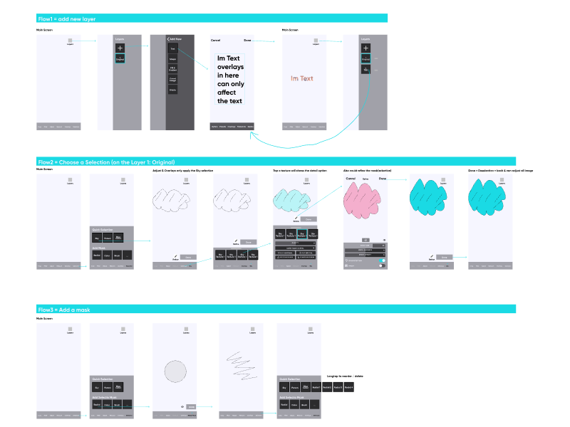
Prototype for the Selection Tool
1. Tips help users start using the Smart Selection Tool.
2. This feature creates selection areas for recognized objects like faces, skies, and bodies.
3. Users can also manually add selection areas with the brush tool.
4. For example, you can auto-select the sky and replace its background.
2. This feature creates selection areas for recognized objects like faces, skies, and bodies.
3. Users can also manually add selection areas with the brush tool.
4. For example, you can auto-select the sky and replace its background.
Prototype for Adjustment Panels and Slider Bars
The original slider controllers confused users and didn't match the usual mental model of the mobile app. Therefore, I explored different approaches and made a high-fidelity prototype for user testing.
👉 Try Prototype(Tapping on the header can switch the UI)
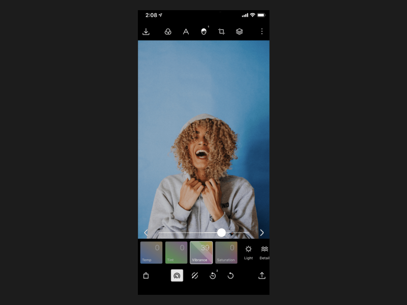
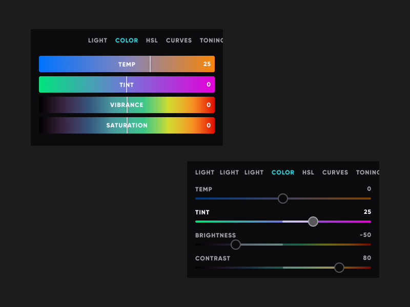
Original Color Tool
New Color Tool Concepts
Prototype
Design System
This is more than just creating a visual style guide; I rebuilt all components and rethought all interactions and controllers to enhance usability and move away from the outdated and cumbersome design.


Old vs. New Version Comparison
Main Page
When users start editing photos, they see the essential tools panel on the first screen.
Despite a minimalistic style, finding features was challenging, and the order felt unclear.

Icons with labels are more significant, precise, and categorized, grouping similar functions.
Filters Panel
Provide various filters, apply them to photos instantly, and showcase the results.

Thumbnails are too small; users must repeatedly apply filters and return to the editing screen to check the results.
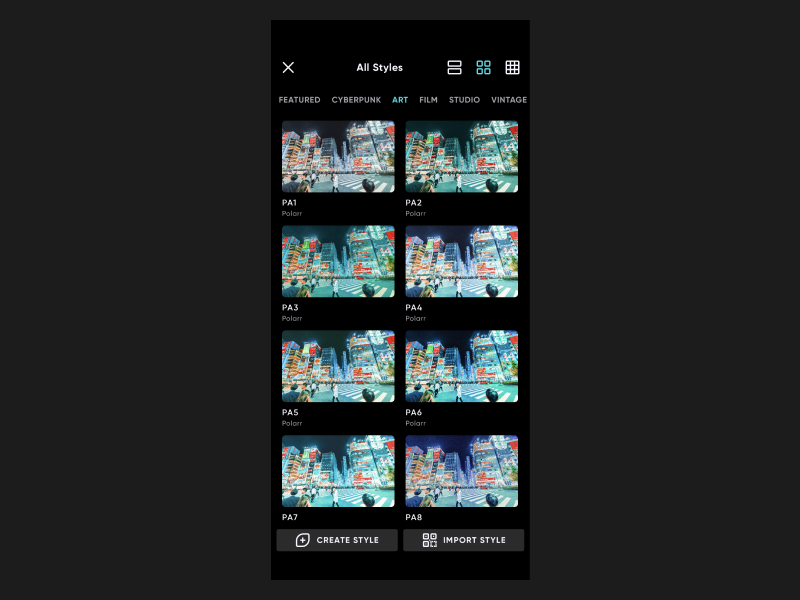
Added three view modes: single, list, and grid view. Use tabs for categories to make browsing easy. Enhance the visibility of create and import filter buttons.
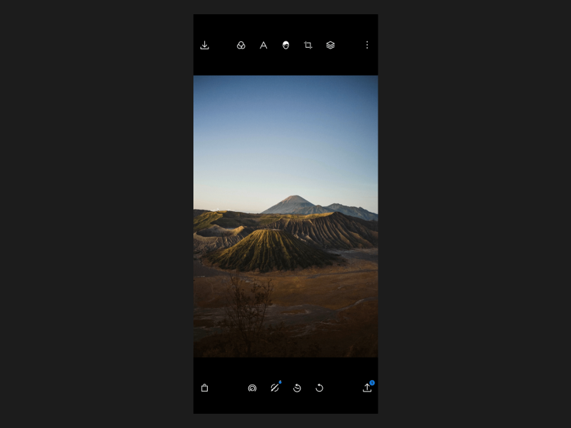
Color Adjustment Tool
Provide professional tools for color adjustments.
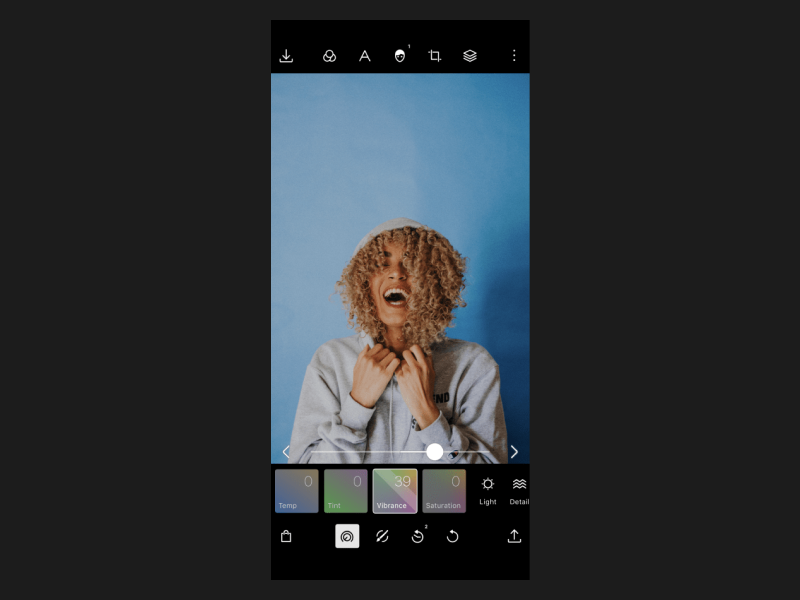
The old version's sliders were difficult to control and confusing.
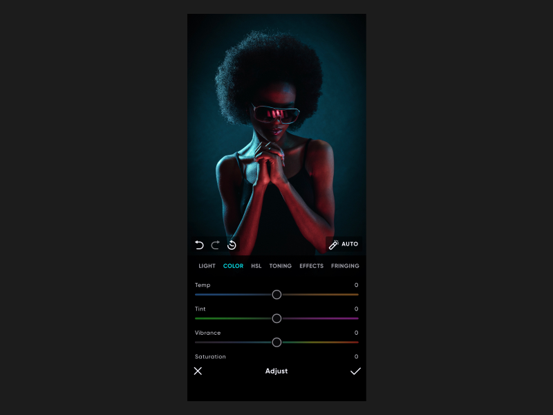
Users can easily adjust values and effortlessly switch tabs to other tools.
Face Tool
Automatically detect faces and provide enhancement and refinement options.

The information structure and layout are scattered, making finding features difficult.
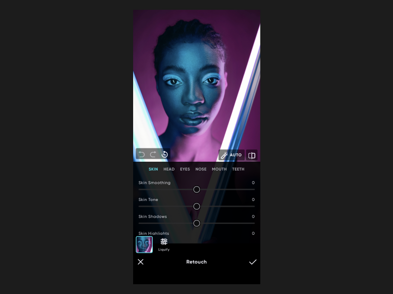
Replaced buttons with tabs, simplified the layout, and moved face retouching to a secondary layer for focused refinement.
Curves Tool
Enables advanced color adjustments for precise tuning.
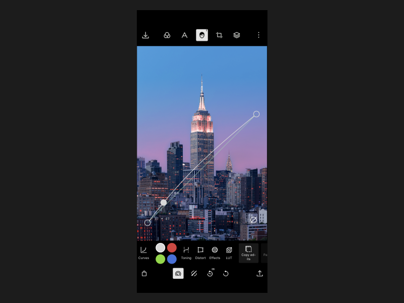
UI elements overlay the image, and the click areas of the toolbar are small and unclear.
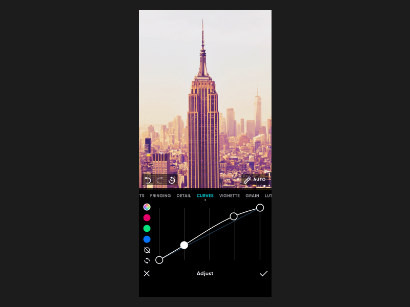
Enables more accurate and consistent control.
Tools Menu
Display all the powerful features within their respective categories.
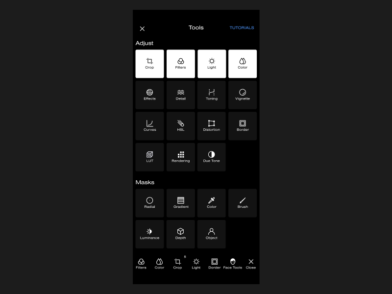
Categories are unclear and take up too much space. Also, users don't know it's scrollable.

Rearranged icons to save space and prioritize essential features to improve discoverability.
Takeaway
Prioritizing and Trade-Offs in Project Management
This ambitious project involved usability improvements, redesigning, and adding new features simultaneously, which extended the development cycle and dispersed our focus across various areas. Although we received positive feedback from user testing, the slow development presented risks in the fast-paced startup setting.
Micro Usability Testing
We conducted a lot of user testing with people from different countries, and some tests took significant time and resources. Finally, utilizing micro-usability testing helped us efficiently gather sufficient feedback early on.

© 2021-2025, ShaoPingChen.